Image Optimization for SEO: Compress, Convert, Speed Up
Master image optimization SEO: compress to WebP/AVIF, size with srcset, add alt text, lazy load right, and lift your Core Web Vitals scores.
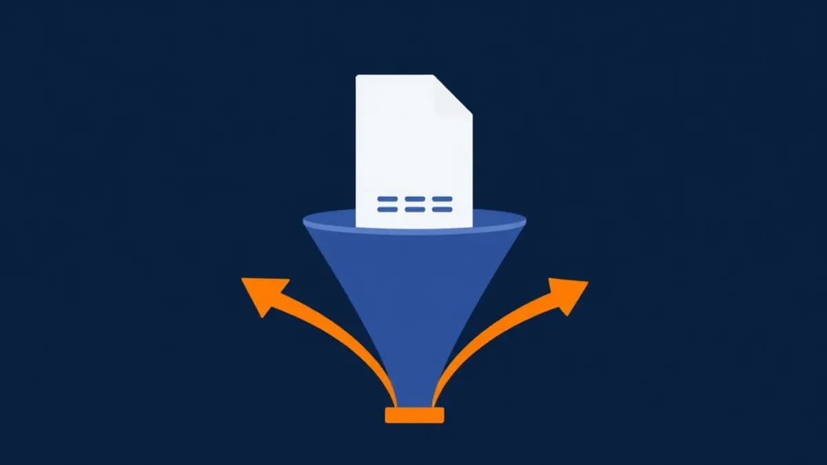
Image optimization for SEO is the practice of reducing image file sizes, picking the right formats, adding descriptive alt text, and serving the correctly sized image to each device — so pages load fast without visible quality loss. It matters because images are usually the heaviest thing on a page and the most common cause of a slow Largest Contentful Paint (LCP), which is a confirmed Google ranking signal. Get it right and you can cut page weight dramatically, render faster, and earn additional traffic from Google Images. This guide walks through the exact steps, the code, and the mistakes that quietly kill your speed.
Why Image Optimization Moves Rankings
Images are almost always the single biggest lever you can pull to improve page speed. According to the HTTP Archive Web Almanac, images make up a large share of the typical page's transferred bytes — and on image-heavy sites like e-commerce stores and portfolios, that share climbs even higher. That makes images the first place to look when a page feels sluggish.
Here is why image optimization belongs at the top of your performance checklist:
- LCP is a Core Web Vital, and it is usually an image. Largest Contentful Paint measures how long the biggest visible element takes to render. On most pages that element is a hero banner, a featured product photo, or an above-the-fold graphic. Google's documented "good" LCP threshold is under 2.5 seconds. A heavy hero image is the fastest way to blow past it. See What Is LCP and How to Optimize Largest Contentful Paint for the full breakdown.
- Slow images push CLS up too. Images without reserved dimensions shift the layout as they load, hurting Cumulative Layout Shift — the other half of the visual-stability story covered in How to Fix CLS Issues.
- Google Image Search is real traffic. Properly named files with descriptive alt text rank in image results and pull additional visitors to your pages.
- Crawl efficiency improves. Lighter pages let Googlebot crawl more of your site within its budget — meaningful for large catalogs with thousands of product photos.
If image weight is dragging your Core Web Vitals, the fix is rarely complicated. It is just rarely done.
Run a free SlapMyWeb audit to see which of these issues your site actually has — we measure your real LCP element, flag oversized images, and list exactly what to fix first.
What Counts as a Fully Optimized Image
Compression alone is not optimization. A complete approach covers six layers, and skipping any one of them leaves speed on the table:
| Layer | What it controls | Typical win |
|---|---|---|
| Format | WebP / AVIF vs JPEG / PNG | 25–50% smaller files |
| Compression | Quality vs file size | 50–70% smaller files |
| Sizing | Resolution served vs displayed | No wasted pixels |
| Responsive delivery | srcset / <picture> | Right file per device |
| Loading strategy | eager hero vs lazy below-fold | Faster LCP |
| Delivery | CDN edge caching | Lower latency |
Hit all six and the cumulative effect on load time is far larger than any single tweak. Now let's go layer by layer.
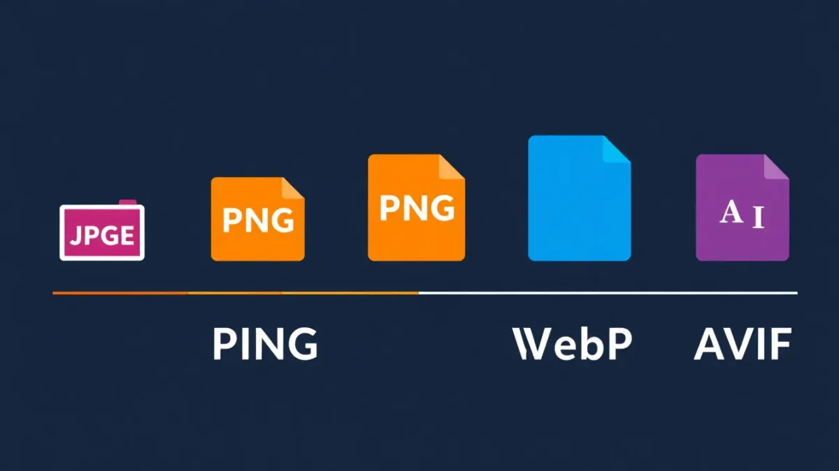
1. Choose the Right Image Format
Format selection is the highest-impact decision in image optimization. The right format can shrink a file by a third or more compared with the wrong one, with no visible quality difference.
- WebP — Best all-around format for photos and complex graphics. Roughly 25–35% smaller than JPEG at equivalent quality, with near-universal browser support. Make this your default.
- AVIF — Next-generation format with even better compression than WebP. Browser support is strong and growing. Serve it to modern browsers with a WebP fallback.
- JPEG — Legacy photo format. Fine as a final fallback, but it should no longer be your primary.
- PNG — Only for images that need transparency (logos, icons with transparent backgrounds). Never use PNG for photographs.
- SVG — Vector format for icons, logos, and simple illustrations. Infinitely scalable and tiny. Use a converter when you need a raster version.
- GIF — Avoid for anything beyond trivial animation. Use MP4/WebM for video.
The ideal setup serves AVIF to browsers that support it, WebP to the rest, and JPEG as the final fallback — handled automatically with the <picture> element or server-side content negotiation. The official guidance in Google's image best practices backs this format-first approach.
2. Compress Without Visible Quality Loss
Compression strips data the human eye cannot perceive. Lossy formats (JPEG, WebP, AVIF) discard imperceptible detail for dramatic size reductions; lossless (PNG) shrinks files with no data loss but smaller savings.
For most web photos, a quality setting around 75–85% produces visually identical results at roughly half to a third of the original size. Target sizes by use case:
- Hero / banner images: aim for 100–150KB, hard ceiling 200KB
- Blog post images: under 100KB
- Product thumbnails: under 50KB
- Icons and UI elements: under 10KB
Do not compress only at upload time. Audit your existing library — most sites carry hundreds of legacy images quietly inflating page weight. A bulk pass over old uploads is often the single biggest speed win available.
3. Resize to Actual Display Dimensions
One of the most common mistakes is serving a 3000px-wide image that displays at 800px. The browser downloads the full file, then shrinks it — wasting bandwidth, memory, and decode time on pixels nobody sees.
Resize images to the width they actually render. If your content column is 800px wide, your images should be 800px wide — or 1600px to stay sharp on retina screens. No wider. A practical responsive ceiling:
- Mobile: ~640px max width
- Tablet: ~1024px max width
- Desktop: ~1280–1920px max width
- Retina: 2× the display dimension
4. Implement Responsive Images with srcset
The <picture> element and srcset attribute let you serve different sizes and formats to different devices — small files to phones, large files to desktops. This is the correct way to handle responsive images:
<!-- Responsive image with multiple sizes and format fallbacks -->
<picture>
  <!-- AVIF for modern browsers -->
  <source
    type="image/avif"
    srcset="hero-400.avif 400w, hero-800.avif 800w, hero-1200.avif 1200w"
    sizes="(max-width: 640px) 100vw, (max-width: 1024px) 80vw, 1200px"
  />
  <!-- WebP fallback -->
  <source
    type="image/webp"
    srcset="hero-400.webp 400w, hero-800.webp 800w, hero-1200.webp 1200w"
    sizes="(max-width: 640px) 100vw, (max-width: 1024px) 80vw, 1200px"
  />
  <!-- JPEG final fallback -->
  <img
    src="hero-800.jpg"
    srcset="hero-400.jpg 400w, hero-800.jpg 800w, hero-1200.jpg 1200w"
    sizes="(max-width: 640px) 100vw, (max-width: 1024px) 80vw, 1200px"
    alt="Team collaborating on website redesign in modern office"
    width="1200"
    height="630"
    loading="eager"
    decoding="async"
  />
</picture>
The sizes attribute tells the browser how wide the image will display at each breakpoint, so it can pick the right file from srcset before downloading anything. Note the explicit width and height — those reserve space and prevent layout shift.
5. Add Descriptive Alt Text
Alt text serves two jobs at once: accessibility for screen-reader users, and signal for Google's image ranking. Both reward the same thing — a specific, honest description of what the image shows.
- Describe the content specifically — "Red Nike running shoes on white background," not "shoes."
- Include relevant keywords only where they fit naturally. Never stuff.
- Keep it under 125 characters.
- Do not start with "Image of…" or "Picture of…" — assistive tech already announces it is an image.
- Use empty
alt=""for purely decorative images (textures, spacers) so screen readers skip them. - Every informational image needs alt text. Missing alt is both an accessibility violation and a wasted SEO signal.
This is a deep topic in its own right — see the full playbook in How to Write Alt Text for Images: SEO + Accessibility.
6. Set the Right Loading Strategy
Lazy loading defers off-screen images until the user scrolls near them, cutting initial load dramatically. But the rule has a critical exception: never lazy load the image that is your LCP element.
<!-- Above the fold — load immediately (never lazy load the hero / LCP image) -->
<img src="hero.webp" alt="Homepage hero banner" loading="eager" fetchpriority="high" />

<!-- Below the fold — lazy load -->
<img src="team-photo.webp" alt="Our development team" loading="lazy" />
<img src="case-study.webp" alt="Client case study results" loading="lazy" />
The native loading="lazy" attribute works in all modern browsers and needs zero JavaScript. For the hero, loading="eager" plus fetchpriority="high" tells the browser to fetch it first. Lazy loading the hero by accident is one of the most common LCP regressions — the deeper mechanics are in Lazy Loading Images and Videos: Complete Guide.
For Next.js applications, the built-in next/image component handles lazy loading, responsive sizing, and format conversion automatically:
import Image from 'next/image';

// Next.js automatically optimizes, resizes, and serves WebP/AVIF
<Image
  src="/images/hero-banner.jpg"
  alt="SlapMyWeb website audit dashboard showing 240+ SEO checks"
  width={1200}
  height={630}
  priority  // Above-the-fold — preload instead of lazy load
  sizes="(max-width: 768px) 100vw, (max-width: 1200px) 80vw, 1200px"
/>

// Below-the-fold image — automatically lazy loaded
<Image
  src="/images/features-screenshot.jpg"
  alt="Detailed SEO audit report with fix code snippets"
  width={800}
  height={450}
  sizes="(max-width: 768px) 100vw, 800px"
/>
7. Serve Images Through a CDN
A Content Delivery Network serves images from edge servers geographically close to each visitor. A user in Karachi gets images from a nearby edge node rather than your origin server thousands of miles away, shaving meaningful latency off every request.
Popular options include Cloudflare (with a free tier), AWS CloudFront, Bunny CDN, and Imgix. Most also offer on-the-fly transformation — resize, format conversion, and compression at the edge — so you don't have to pre-generate every variant by hand. CDN delivery is one piece of a broader speed strategy; the full picture lives in How to Improve Website Speed: The Complete 2026 Guide.
8. Convert Your Legacy Image Backlog
If your site has accumulated JPEG and PNG files over years of uploads, batch-convert them to WebP (or AVIF) for an immediate, site-wide performance gain. For product shots where you want a clean transparent background, remove the background first, then convert to WebP with alpha-channel support.
This one-time cleanup often moves Core Web Vitals more than any single new feature, because it fixes the heaviest pages all at once.
The Image SEO Checklist
Run every image through this before it ships:
- File name — Descriptive and relevant:
blue-running-shoes.webp, notIMG_4532.jpg - Alt text — Specific, keyword-natural, under 125 characters
- Dimensions —
widthandheightset to prevent layout shift (CLS) - Format — WebP or AVIF primary, JPEG fallback
- Compression — Under the target size for its use case
- Loading —
eager+fetchpriority="high"for the LCP image,lazybelow the fold - Structured data — Product images referenced via the
imageproperty in Product schema - Image sitemap — Important images listed in your XML sitemap for Google Image indexing
This checklist plugs directly into a broader complete SEO audit — images are one pillar of a healthy technical foundation.
Common Image Optimization Mistakes
No compression at all. Raw camera photos dropped straight into the CMS — a single uncompressed JPEG can run several megabytes. Compress before upload, every time.
Missing alt text everywhere. A double failure: screen readers can't describe the image and Google can't fully index it. Audit your whole library, not just new uploads.
Wrong dimensions causing layout shift. Without width and height, the browser can't reserve space, so content jumps as images load. That is Cumulative Layout Shift, and it hurts both UX and rankings.
Lazy loading the hero. Your above-the-fold LCP image must load immediately. Lazy loading it adds avoidable delay to your LCP score — a frequent and easily-missed regression.
Using PNG for photographs. PNG is lossless and balloons file size for photographic content. A photo that is megabytes as PNG is often a fraction of that as WebP at quality 80 — with no visible difference.
These image issues rarely live alone; they usually sit inside a wider set of speed problems covered in Google PageSpeed Score: What It Means and How to Get 90+, and they hit e-commerce stores hardest, as detailed in Core Web Vitals for E-commerce.
Where Image Optimization Fits in the Bigger Picture
Image work is the highest-leverage slice of technical performance, but it is one slice. Pair it with clean code, smart caching, and solid fundamentals from The Complete Technical SEO Guide, and make sure the Core Web Vitals that images influence — LCP, CLS, and INP — are all green. If those metrics are unfamiliar, start with Core Web Vitals: LCP, CLS, INP Explained. Done together, these moves compound: faster renders, better scores, and a real shot at ranking in both web and image search.
Frequently Asked Questions
Does image optimization really affect SEO rankings?
Yes, directly. Images drive your Core Web Vitals scores — especially LCP and CLS — and those are confirmed Google ranking signals. Optimized images with good alt text and descriptive file names also rank in Google Image Search, adding a second traffic source. Reducing image weight is one of the most reliable ways to improve page experience.
What is the best image format for websites?
WebP is the safest default thanks to near-universal browser support and roughly 25–35% better compression than JPEG. AVIF compresses even more aggressively, so the ideal setup serves AVIF to browsers that support it and falls back to WebP, then JPEG, using the <picture> element. Reserve PNG for transparency and SVG for icons and logos.
Should I lazy load all images on my page?
No. Never lazy load your hero or any image visible above the fold on first paint — those should use loading="eager" and fetchpriority="high" so they render as fast as possible. Lazy loading is only for images below the fold that the user has to scroll to reach. Lazy loading the LCP image is a common mistake that makes LCP slower, not faster.
What is a good target file size for a hero image?
Aim for 100–150KB and treat 200KB as a hard ceiling for a full-width hero. You usually reach that by serving WebP or AVIF at quality 75–85, sizing the image to its real display width, and using srcset so phones receive a smaller file than desktops.
How do I find which images are slowing down my site?
Run a free SlapMyWeb audit. The performance check identifies your actual LCP element, flags oversized and wrong-format images, detects missing lazy loading, and reports images without alt text — then hands you a prioritized list of exactly which images to fix first for the biggest speed gain.
SlapMyWeb Team
We build SlapMyWeb — a brutally honest AI website audit that scans 240+ SEO, performance and Core Web Vitals signals and hands you the fix code.